

The redesign of Comhem Play
In 2019 Tele2 decided to relaunch the Comhem Play service to better compete with other streaming competitors.

My role
Creative Director – set brand vision and design strategy. Created design concepts to set direction for others to align around: both logo and product design. Strategic partner to Marketing, Tech and Tv Product. I also did the design planning and staffing.
KUDOS TO THE TEAM – Fredrik Suter UX Lead, Sara Frank Senior UX designer, Annelise Müller Brand Designer, Julius Andersson Product Designer.
Background
Com Hem Play as a service already existed and was a platform defined as an extension for Com Hem tv-customers. The experience were built around these customer needs, which primarily were a tv everywhere experience based on tv schedule and recordings of your favourite shows in any of your preferred device. The intent of the old visual style and branding was to strengthen the Com Hem brand, hence using the same light color schemes and typography.

BEFORE: The old Com Hem Play experience was intentionally connected to the Com Hem brand.
Goals
The new business goals was to attract non Com Hem segments, with a new standalone subscription with streaming only content at a fair cost. The product and the brand experience needed a revamp to be up to date and to be distinguished from Com Hem.
Challenges
The largest challenge was to keep so many things rolling simultaneously: a new brand & identity, a new web purchase flow, improved product design in all platforms, introducing a new Samsung Smart Tv app and to build a new design system introducing new members to the design team. All should happen in 6 months without loosing pace for continuous improvements for the existing Comhem Play service.

AFTER: The new Comhem Play experience with a more unique branding and product design.
Design strategy
I took lead on defining the design strategy. The purpose was to get sign off on the key activities and alignement around focus and features to be delivered. The strategy was divided in three different areas: 1/Brand 2/Identity and 3/Product Design. The first step was to set creative direction and get sign off early from key stakeholders on a vision. After that I introduced the Play design team with a clear framework and prio for the challenge ahead.

I defined a design strategy and lead activities within 3 areas: Brand, Identity and Product design to help the team with prio and framing.
Process
1. BRAND
I planned and facilitated the kickoff workshop with key management stakeholders to set the cornerstones for the brand: personality, tonality, benefits, position etc. After that I took some time to design different concept directions and started to explore colors, shapes, logo symbol, typography and the usual suspects. Regular checkins with our Marketing, Product Director and design team made progress smooth.
A big strategic decision were about the name itself: should we keep it or rename it? Many debates were between Complay and Comhem Play. After some discussions we landed in keeping the name Comhem Play but upgrade the looks and make it stand out more as a brand, still with a hint of origin. That’s why we landed in using the circles from the Com Hem logo, but modernise the colors and make them shape a triangle to be interpreted as a Play symbol.
One of many monochrome explorations for the logo to help shaping the brand design direction

Early explorations of background colors in product design to help set cornerstones for colors in the brand.
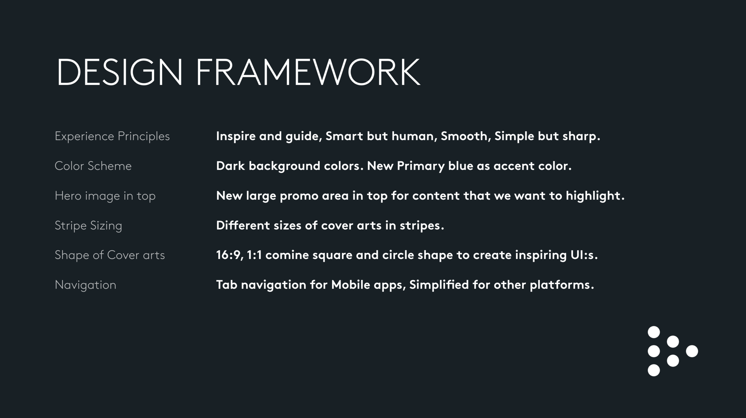
Framework for the product design to help designers keep focus and explore within the constraints.

The design team in action in workshops that helped us shape the new experience, and yes I was there as well, facilitating the work.
The Design team
After sign off from key stakeholders on brand direction, I on-boarded the design team: 2 Product designers with task to redefine the logged in experience in all six platforms, 1 UX designer with focus on creating a new purchase flow and my pages on the web platform and 1 Visual designer to finalise the logo and brand elements.
IDENTITY
Product designers and Visual designer collaborated a lot in the beginning to set the colors for both product and brand. My role transformed to inspire, coach and perform design reviews to make sure we kept to the right path.
PRODUCT DESIGN
For the logged in experience we kicked off a cross functional workshop with tech and product to identify the most important areas to improve from todays product, since that was the frame for the job ahead. After that we created some basic experience principles to help us in the design decisions. So with those principles, some color directions and key areas in the product to improve we had a direction moving forward.

The new Samsung Smart Tv experience is a good example on how the design evolved from the initial framework.
The Logged out experience
The UX Designer defined a new logged out experience with a functional purchase flow. My role was to coach and mentor the designer, letting her lead the process rather than me. Together with the Product Manager she facilitated workshops with key Engineering stakeholders to understand limitations and challenges.
The main challenge was to design a simplified purchase flow, without confusing the current Com Hem Play customers – who should still be able to use their service as before, but with the possibility of adding a new and more content. This was the biggest challenge from a flow perspective and many different versions were user tested before final version was decided.

The User story map helped us understand the different user needs and actions needed internally when walking through the purchase flow for the new Comhem Play.
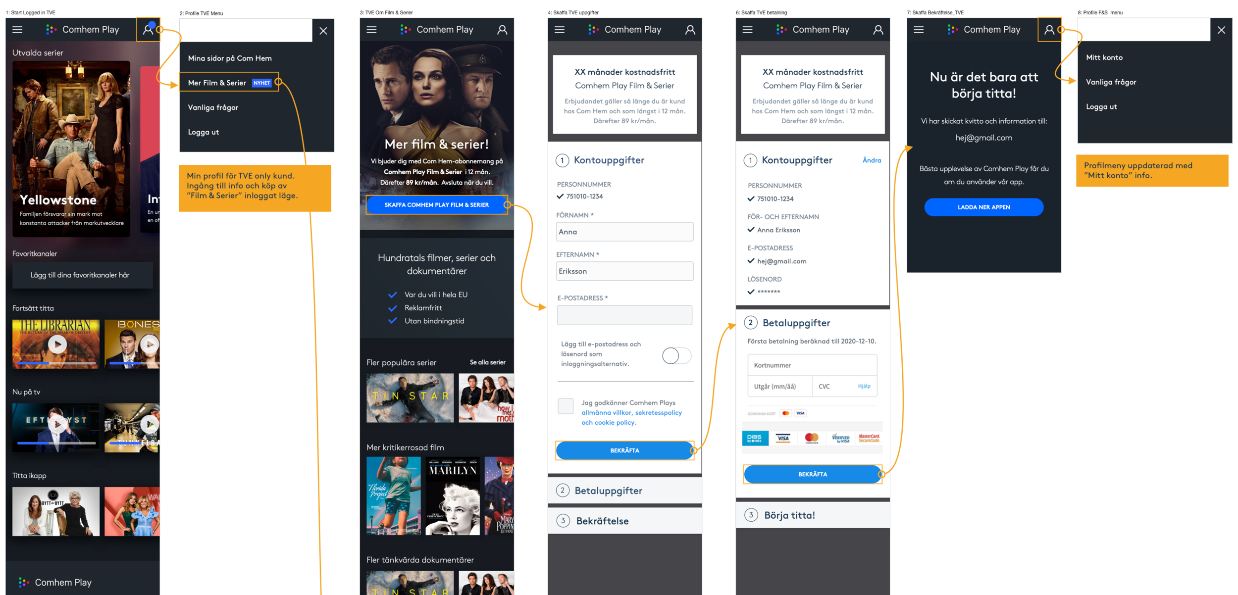
Clickable prototypes from screens like this were tested in mobile devices to get feedback from real users before taking decisions.
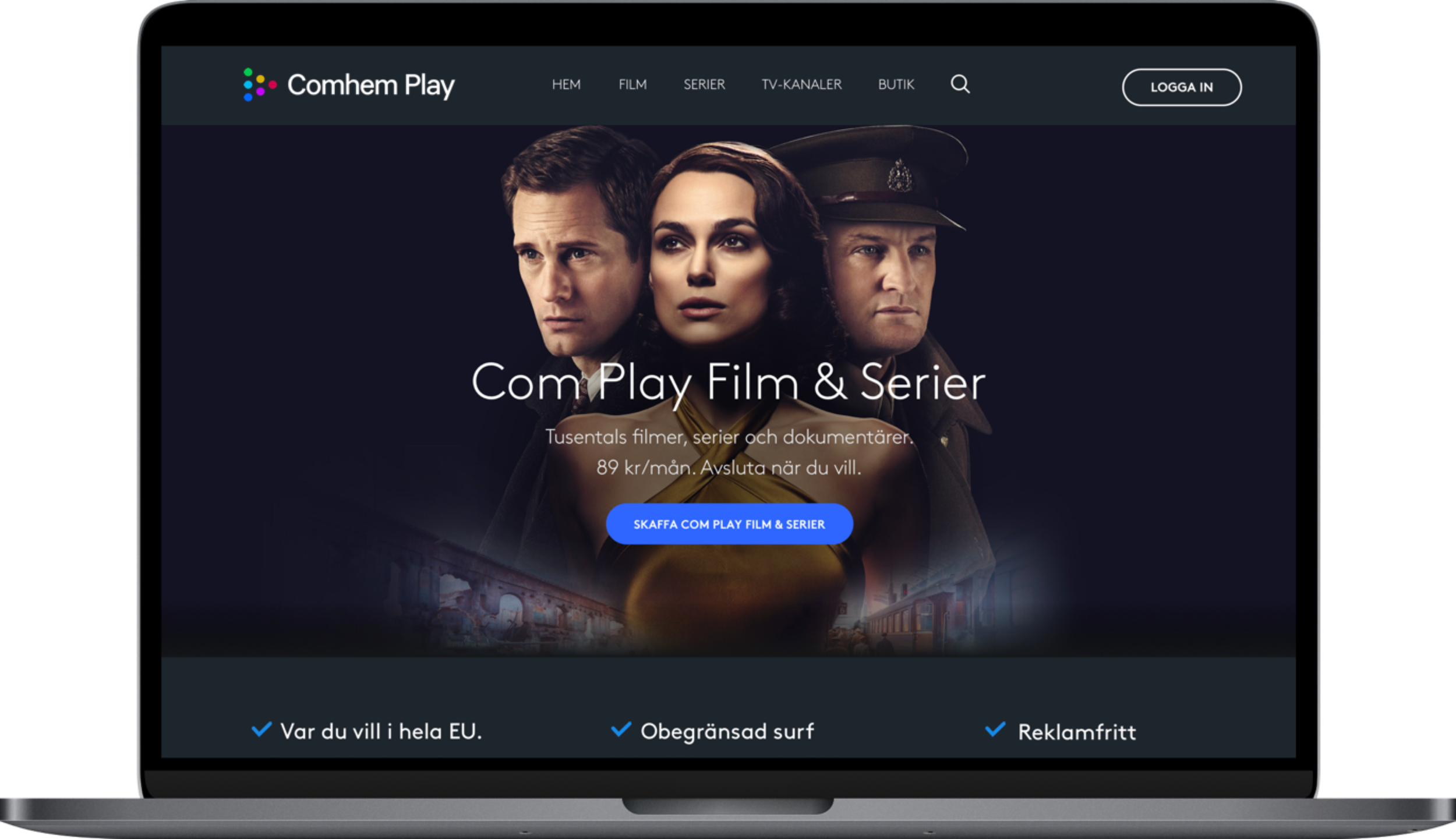
Concept design for Web Start page logged out experience in desktop resolution.
Product Discovery and Delivery
I encouraged the team to experiment a lot within the framework and to explore new ideas in discovery and test them on users before delivery. Always in tight collaboration with tech and product peers. This was crucial due to the fact that we still needed to deliver features and improvements in the current product.
We also involved users continuously to constantly evaluate our explorations. We used everything from paper sketches, wireframes, UI mockups, motion design prototypes to get feedback on the areas we focused most on.

To discover the right solutions the team designed many ideas in cross functional design studio workshops and tested them on real users to understand what would be the best solution to deliver.

Result & learnings
Slicing features and building them with continuous releases in the current product was part of the success. The only major release we did was to launch the new purchase flow on web in an internal Beta in December2019 and external launch in February 2020. We also got input from real users and iterated on that feedback.
One important agreement with key stakeholders was that the launch was just the starting point when it comes to improvements in the user experience. We created a vision and a thematic roadmap based on the user insights we got along the way. Moving forward we’re still building the design system and knowledge around what works for our customers.
Failures along the way were many and part of the process to learn early and modify ideas and design. Fast prototyping tested on users helped us modify and improve our ideas continuously. One major learning is that we reduced too much info on the logged out start page early on, which made it hard for users to understand the offer, iterations made us find the sweet spot of relevant information. If I could change the strategies now I would have spent more time exploring more options for the logo and the branding expression, but given the time scope, the goals and the team effort, I’m still super proud of the direction we took in delivery and the changes we made. And in summer 2020 Comhem Play was the most growing streaming service in Sweden, which is cool!